The CORE Featured in Best Offices Ottawa
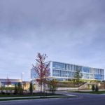
The Tomlinson Group’s new home rises from its surroundings amid sloping berms growing tall grass that seem to lift the building from the ground. Natural rock features call to mind the floor of a quarry – one of Tomlinson’s core business lines – and the slabs of concrete that create the entrance are accented with the heavy construction firm’s name in its signature red.
The longstanding family business wanted to consolidate its employees. The result, designed by local firm Christopher Simmonds Architect, keeps Tomlinson’s work and history in mind, explains Samantha Schneider, the project lead for Christopher Simmonds Architect. The combination of concrete, earth, natural landscape features and local stone are meant to call to mind what the company does best, and the firm’s proposal felt a perfect fit to CEO Ron Tomlinson.
“It fit into what we are and what we do,” says Tomlinson.
A state-of-the-art testing facility is just a few steps away from the main building. It was important to Tomlinson that the facility was part of the new building, reflecting the importance the firm places on the quality of its asphalt, aggregate and other products.
Making an entrance
Unlike a conventional suburban office that sits behind a massive parking lot, Tomlinson’s building features only a few visitor spaces out front. An employee parking lot is discreetly tucked into the rear of the property adjacent to an outdoor patio for staff – complete with a barbecue – and landscaping that includes rocks hauled from Tomlinson’s quarries.
The building’s tall glass doors open automatically, since staff are often coming through with their arms full. Staff arriving from worksites have the option of turning directly into a changeroom on the ground floor, which also features two large rooms where the company hosts classroom-style training on technology, safety, leadership and management.
There’s also a full gym facility, with an outdoor basketball court in the works. With employee health in mind, the company also offers wellness and fitness classes. Overall, two-thirds of the ground floor is dedicated to common facilities.
“Everyone here works hard and plays hard,” says Tomlinson, adding he wants staff to be happy, and to feel pride in their job, career and company.
Just off from the spacious atrium is a catered cafeteria that Tomlinson says works around the needs of their industry, with an emphasis on breakfast and flexible lunch times.
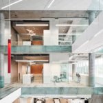
“The whole business just functions better,” Tomlinson says of the cafeteria, adding that eating together is an essential part of company culture. The entire space is lit with natural light from the atrium, which stretches up three of the four floors.
Schneider says the atrium invokes something vital to the way the space functions: a sense of community.
“We wanted to make a dynamic space in the centre of the building,” she says. “You always feel people moving around.”
Tomlinson adds that any initial concerns about acoustics were assuaged once everyone moved in.
“Nobody can believe how quiet it is,” he says, adding that the water feature cascading down several floors of the atrium helps mask sound.
Though there are some workspaces on the first floor, most of the offices, cubicles and board rooms begin on the second floor. Everything is centred around the core of the building, and each floor differs slightly to reflect how various departments operate.
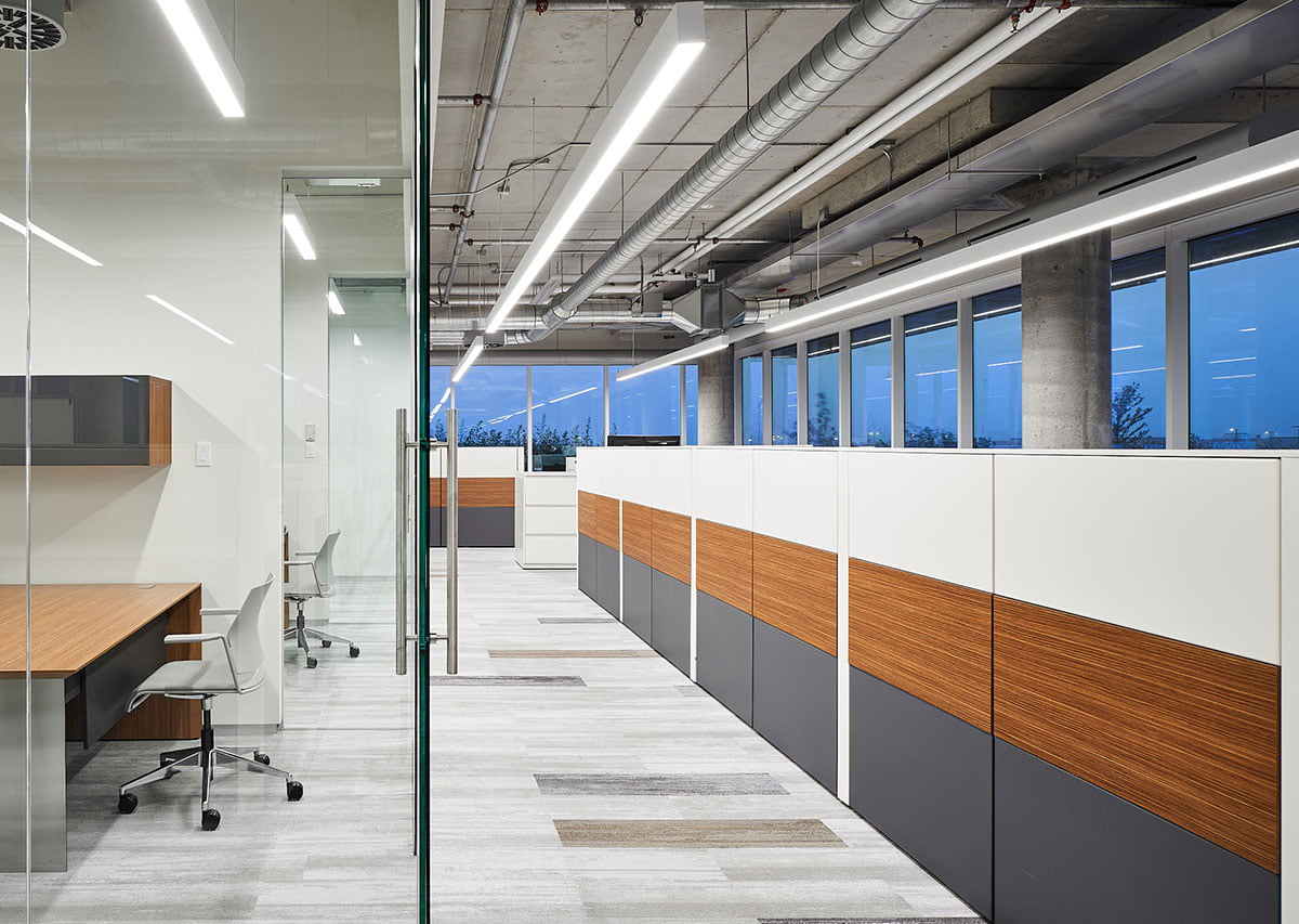
Outside the second floor, the grasses planted in the berms grow up to the glass. With the enclosed offices in the middle of the building, the tall windows ensure light reaches everyone in the building, illuminating features such as the exposed ceiling, a feature the client specifically requested.
“There was extra care in the mechanical design … it’s a very clean look, but very exposed,” says Schneider. Tomlinson points out discreet custom diffusers set against the glass and extra sheet metal tucking wires and pipes away among the round concrete columns placed further than usual from the windows.
“We exposed as much concrete as we could,” says Schneider.
Younger workforce
There are wood accents, muted browns, and hints of the Tomlinson red wherever possible. Scattered common areas are interspersed with larger meeting rooms, including two large board rooms that overlook the atrium.
“There’s an incredibly high importance put on common facilities,” says Schneider, adding that while tech companies are increasingly known for open-concept, collaborative workplace designs, it’s not a concept frequently embraced in the construction sector.
“This is an industry that is not used to working in this kind of space,” she says.
Tomlinson says this is, in part, a result of the extensive feedback the company gathered from its increasingly younger employees. By listening to their thoughts on collaborative space and increased connection between departments, he says the company can stay ahead of the curve.
“The younger that the workforce gets … the more important some of these items get,” he says.
This is exactly the kind of workplace that Christopher Simmonds Architect specializes in: calm, open, community-oriented spaces. A close working relationship with the client means flexibility when it comes to changes, says Schneider.
“Everything that was a challenge made the project better.”
For example, the 170-person office turned into 240 overnight during construction with a couple of acquisitions.
“We had designed for growth,” says Schneider. For example, the centre of the top floor was filled in to create more space, and parts of the office were redesigned to accommodate additional employees.
“Everything that was a challenge made the project better,” says Schneider.
For Tomlinson, the project’s success is evident.
“The biggest feedback is the smile on people’s face when they come in or leave the building,” he says. “Everybody can feel it.”
Article reprinted from Best Offices Ottawa
Photo credit: Doublespace Photography

